Typography
Graffiti
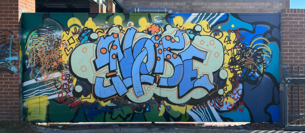
“Graffiti” was a project close to my heart, focusing on the ability to seamlessly transition someone’s style into a new piece. Central to my learning was mastering the art of maintaining visual consistency throughout a project, ensuring a cohesive flow. “Noise” helped to further develop these skills, allowing me to refine my design process and create harmonious visual narratives.
Inspiration
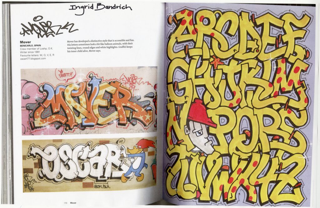
Characterized by bold letters, vibrant colors, and intricate details at the end of each stroke, Mover’s style served as the foundation for my own piece Noise.
Sketch Development
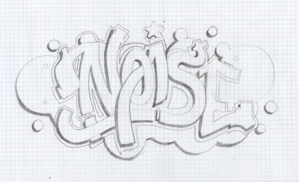
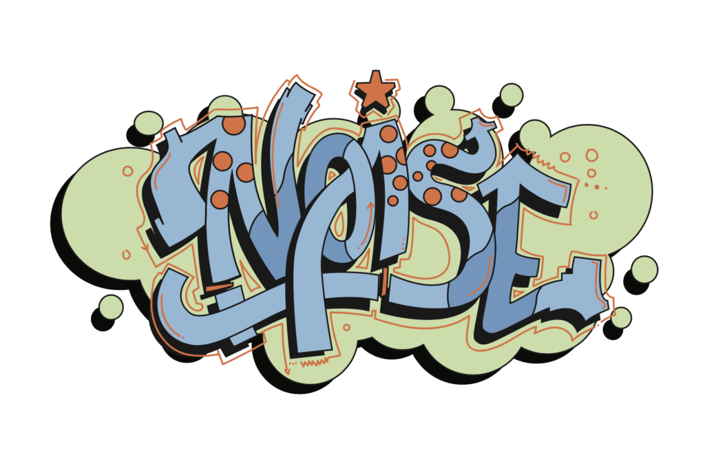
I deep dive into studying Mover’s distinctive style, analyzing his shapes and forms through multiple sketches. After grasping the essence of his alphabet, I made a final sketch that showcased all of his characteristic elements. Transitioning to digital platforms like Illustrator and Adobe Fresco, I refined the sketch, ultimately creating a mock-up of the final piece.
Final Phase
Using the doodle-grid method I was able to transfer my sketch into the wall. Here is a small snap when I was making the graffiti on the wall, such a fun process!
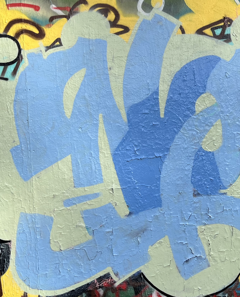
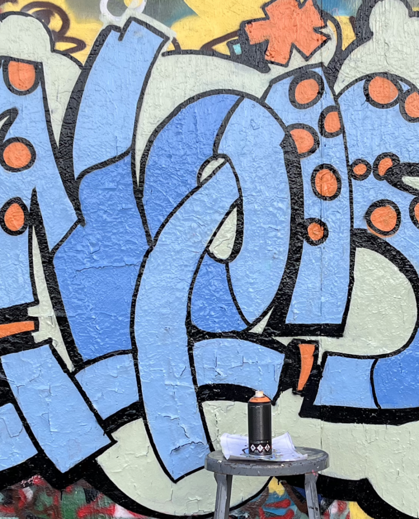
Capturing the journey, I documented several snapshots during the creation process, from the initial design on the wall to the final piece. Using Photoshop, I fine-tuned the image to ensure it seamlessly fit a flat wall, eliminating any distortion in the corners. Witnessing the project evolve into a vibrant piece that drew people to take photos in front of it was really exciting!
